
How to Find the Perfect Color Palette and Logo for Your Brand (Without Hiring a Designer)
 You know that feeling when you’re scrolling Instagram and you see a brand that just looks right? The colors work together. The logo feels professional. Everything clicks.
And then you look at your own business and think, “How do I get that?”
Here’s the good news. You don’t need a design degree or a five-figure budget to create a brand that looks polished and professional. Whether you’re launching a side hustle, starting a YouTube channel, building a podcast, or opening your first online shop, you can absolutely figure out your color palette and logo yourself.
I’m going to walk you through exactly how to do it.
Why Your Colors and Logo Actually Matter
Before we dive into the how, let’s talk about the why for just a minute.
Your brand colors and logo are often the first things people notice about your business. They show up on your website, your social media profiles, your business cards, your email signature, and anywhere else you exist online or in person.
When your colors and logo feel cohesive and intentional, people trust you more. They remember you. They recognize your content when it pops up in their feed.
And when your branding feels scattered or thrown together? People might scroll right past.
This doesn’t mean you need to be perfect. It just means you need to be intentional. And that’s something you can absolutely do, even if you’ve never thought about design before.
Step One: Start With How You Want People to Feel
A lot of people jump straight to picking colors they like. And that’s fine for a starting point. But the brands that really work are the ones that think about emotion first.
Ask yourself: How do I want people to feel when they see my brand?
Do you want them to feel calm and grounded? Energized and inspired? Trustworthy and professional? Playful and creative?
Your answer to that question is going to guide everything else.
For example, if you’re a therapist or a wellness coach, you might want people to feel calm and safe. That might lead you toward soft blues, greens, or neutrals.
If you’re launching a bold new product or a high-energy fitness brand, you might want people to feel pumped up. That could mean bright reds, oranges, or electric blues.
If you’re a financial planner or a business consultant, you probably want people to feel like you’re trustworthy and competent. That might mean navy, charcoal, or deep green.
There’s no right or wrong answer here. The point is to start with the feeling, not just the color.
Step Two: Look at Brands You Admire
Once you have a sense of the feeling you’re going for, start paying attention to brands that give you that same vibe.
Screenshot their websites. Save their Instagram posts. Notice what colors they use and how they use them.
You’re not copying them. You’re learning from them. You’re training your eye to see what works.
As you collect examples, you’ll start to notice patterns. Maybe the brands you love all use a lot of white space. Maybe they pair a bold color with neutrals. Maybe they use warm tones or cool tones.
This is your mood board. And it’s going to help you make decisions when you’re staring at a color picker and feeling totally overwhelmed.
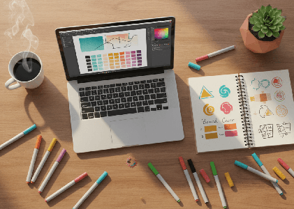
Step Three: Use a Color Palette Generator
Okay, now we get to the fun part. Actually picking your colors.
There are a bunch of free tools online that make this so much easier than it used to be. Here are my favorites:
Coolors is probably the most popular color palette generator out there. You can hit the spacebar to generate random palettes, lock in colors you like, and adjust shades until you find something that feels right. You can also upload an image and pull colors from it, which is super helpful if you have a photo or a piece of art that captures the vibe you’re going for.
My favorite color palette website is Color Hex. You can view the latest palettes, search all the color palettes on the site and then drill down into the colors you like. It’s also great if you want to understand the theory behind why certain colors work together. You can choose a base color and then see complementary, triadic, and tetradic options to get more ideas. Sometimes I just pull up the Latest Palettes page on Color Hex for fun. It’s amazing to see what colors can go together.
Adobe Color is another great option. It’s a little more advanced, but it gives you a ton of control. You can explore color rules like complementary, analogous, and triadic, which basically means the tool helps you find colors that naturally work well together. You can also browse thousands of palettes that other people have created and saved.
Canva‘s Color Palette Generator is built right into Canva, and it’s perfect if you’re already using Canva for your graphics. You can upload a photo and Canva will pull a palette from it. This is especially helpful if you have a brand photo or a product shot that you want your colors to match.
Here’s my advice: Start with Color Hex. If it’s too complex for you, try Coolers. Play around. Generate a bunch of palettes. Save the ones that feel right. Then narrow it down to two or three options and sit with them for a day or two.
You’ll know when you find the right one. It’ll feel like, “Oh, that’s it.”
How Many Colors Do You Actually Need?
You don’t need a rainbow. In fact, too many colors can make your brand feel chaotic.
Most brands work with three to five colors:
- One primary color. This is your main brand color. It shows up the most. It’s the color people will associate with you.
- One or two secondary colors. These support your primary color. They add variety without overwhelming things.
- One or two neutral colors. Think white, cream, gray, or black. These give your eyes a place to rest and make your other colors pop.
That’s it. You don’t need more than that.
And honestly, if you’re just starting out, you could get away with one primary color and two neutrals. Keep it simple. You can always add more later.
What If You’re Stuck Between Two Palettes?
This happens all the time. You find two palettes you love and you can’t decide.
Here’s what I do: Test them.
Create a quick mockup of your website header or your Instagram profile using each palette. Or make a simple graphic with your business name in each color scheme.
Then step away for a few hours. Come back and look at them with fresh eyes.
Which one feels more like you? Which one feels more like the business you’re building?
Trust your gut. You’ll know.
Now Let’s Talk About Your Logo
Once you have your color palette, it’s time to think about your logo.
And I’m going to be honest with you. If you have the budget to hire a designer, that’s always going to give you the most custom, polished result.
But if you’re bootstrapping this thing and you need a logo today, there are some really solid DIY options.
Logo Builders That Actually Work
Here are the tools I recommend for creating a logo yourself:
Canva is the easiest place to start, especially if you’re already using it for social graphics. Canva has thousands of logo templates you can customize with your business name, your colors, and your fonts. You can also start from scratch if you want more control. The free version gives you a ton of options, and Canva Pro unlocks even more templates and the ability to resize your logo for different uses.
Looka (looka.com) is an AI-powered logo maker that asks you a few questions about your style and then generates dozens of logo options for you. You pick the ones you like, and Looka refines the options based on your choices. Once you find a logo you love, you can buy it and download all the file types you need. It’s not free, but it’s way cheaper than hiring a designer, and the logos look really professional.
Hatchful by Shopify is completely free and super simple. You choose your industry, pick a style, and Hatchful generates logo options for you. You can customize colors and fonts, and then download your logo in different sizes for social media, your website, and print. It’s a great option if you’re on a tight budget and you just need something clean and functional.
Tailor Brands is another AI tool that creates logos based on your preferences. It’s similar to Looka, but it also offers branding packages that include business cards, social media templates, and more. If you want a more complete branding kit, this might be worth checking out.
Wix Logo Maker is free to use and generates logos based on a quick questionnaire. You can customize fonts, colors, and layouts, and then download your logo. If you’re already building your website on Wix, this integrates really smoothly.
What Makes a Good Logo?
No matter which tool you use, here are a few things to keep in mind:
Keep it simple. The best logos are clean and easy to recognize. Think about Nike, Apple, or Target. You don’t need a lot of detail or fancy effects. Simple almost always wins.
Make sure it works in black and white. Your logo should still look good if you print it on a black and white document or use it on a plain background. If it only works in color, it’s going to limit you.
Think about where you’ll use it. Your logo needs to work on your website, your social media profiles, your business cards, and anywhere else you show up. That means it needs to be readable at small sizes and still look good when it’s blown up big.
Choose fonts carefully. If your logo includes text, pick a font that matches the vibe of your brand. A playful script font might work for a bakery, but it’s probably not right for a law firm. And make sure the font is readable. If people can’t read your business name, your logo isn’t doing its job.
Don’t overthink it. Your logo doesn’t have to be a work of art. It just needs to represent your business in a way that feels professional and intentional. You can always refine it later as your business grows.
Putting It All Together
Once you have your color palette and your logo, you’re going to use them everywhere.
Add your logo to your website header, your email signature, your social media profiles, and your business cards.
Use your brand colors consistently across all your graphics, your website, and your marketing materials.
The more consistent you are, the more recognizable your brand becomes.
And here’s the thing. Your branding doesn’t have to be perfect right out of the gate. It just has to be intentional.
You can always tweak your colors or update your logo as you grow. But starting with something cohesive and professional is going to make everything else easier.
A Few Final Tips
Don’t be afraid to start simple. You don’t need a complicated logo or a huge color palette. Start with the basics and build from there.
Test your colors and logo on different backgrounds. Make sure they work on white, on dark backgrounds, and on photos. You want flexibility.
Save all your brand assets in one place. Create a folder with your logo files, your color codes, and your fonts. That way, when you need to create something new, you’re not scrambling to remember what shade of blue you used.
Ask for feedback, but trust yourself. It’s fine to show your logo and colors to a few trusted people and get their input. But at the end of the day, this is your business. If it feels right to you, go with it.
How I Can Help
If you’re feeling overwhelmed by all of this, or if you want someone to handle your branding and website so you can focus on actually running your business, that’s exactly what I do at Footprint Media Machine. I work with small business owners, creatives, and side hustlers to create websites, logos, and content that feel professional and on-brand without the stress. Whether you need a full website, a logo, or just someone to help you figure out your colors and pull it all together, I’d love to help. Let’s make your brand feel like you.